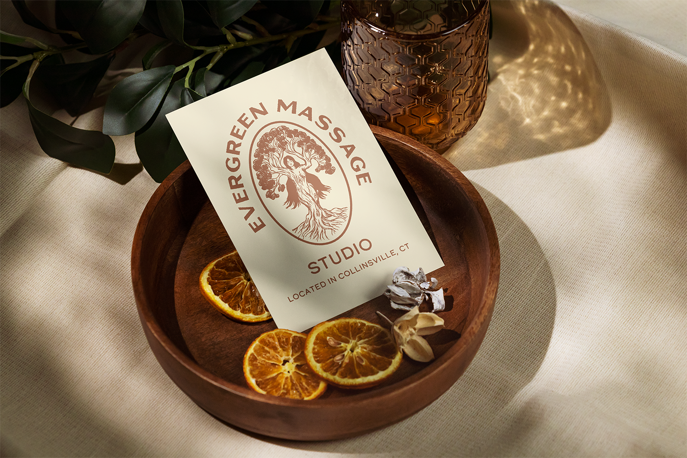
Kate Francis approached me to redesign the logo for her business, Evergreen Massage Studio. She felt that her current logo didn't truly reflect her personality and wanted her brand to showcase her down-to-earth, "crunchy" vibe. It was also important for the new logo to translate well onto branded apparel.
Together, we developed an earthy logo that embodies her style, featuring a deep burnt sienna as the main color. The logo includes imagery of a woman transforming into a tree, symbolizing the name "Evergreen." The tree's grain was meticulously crafted to resemble muscle fibers, connecting back to the core principles of her practice.
Kate was thrilled with the result, expressing her excitement about ordering t-shirts and finally having a professional uniform for her work. She's also looking forward to providing branded merchandise to her clients, who have been requesting it since she began her practice.
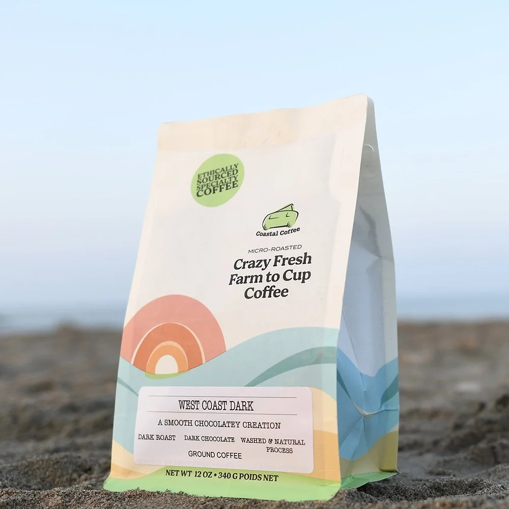
In collaboration with Amanda DeVries of Eye Candy Design, I contributed to the packaging refresh for Coastal Coffee. Ben and Bri, the passionate owners who started their roasting journey in the back of a green hippie van, continue to embody their zest for life in everything they do. As they aimed to expand their presence in the e-commerce and retail markets, it became clear that their packaging and branding needed an upgrade to reflect their unique spirit and differentiate themselves.
The project kicked off with a branding refresh, focusing on preserving the iconic van graphic while enhancing its impact. We integrated coastal elements to pay homage to the brand's roots and lively personality. This transformation not only revitalized Coastal Coffee’s packaging but also reinforced their story and appeal to a broader audience of coffee enthusiasts.
Throughout the project, Ben and Bri remained true to their company ethos by sourcing a fully compostable bag and creating single-serve pourovers that were a more sustainable alternative to coffee pods. They were passionate about reducing their environmental impact and ensuring that their coffee was as eco-friendly as possible.
Harbor Hearth is a cozy coffee shop located in the heart of Eureka, California, dedicated to celebrating the rich flavors and rustic charm of the Pacific Northwest. At Harbor Hearth, they pride themselves on crafting brews that warm your soul, using locally sourced beans and artisanal blends. Whether you're a local or just passing through, their welcoming retreat offers a perfect escape with every cup. Come experience the essence of the Pacific Northwest in every sip.
Richard and Mengistu Koilor made history with the launch of Two Locals Brewery in University City on January 31, marking a significant milestone as the first Black-owned brewery in Philadelphia.
Prior to opening day, they eagerly searched for a custom t-shirt design to commemorate the occasion. Inspired by the lively and nostalgic style of "School House Rock," both brewers envisioned a fresh and funky look.
The brewery's catchphrase, "West Philly the Best Philly," seemed perfectly fitting for their inaugural branded t-shirt. Today, these tees are proudly worn by brewery staff as they passionately serve their beloved West Philly community.
I am currently the Creative Designer for Watson Farmhouse Brewery, in charge of creating original illustrations and typography for its distinctive line of craft beers. I work directly with the Master Brewer, John Watson.
John Watson has been brewing beer for 26 years and in 2019 he opened Watson Farmhouse Brewery in Southbury, CT. Using his inventive concepts as inspiration, I create visual representations to be used as packaging for his brews.
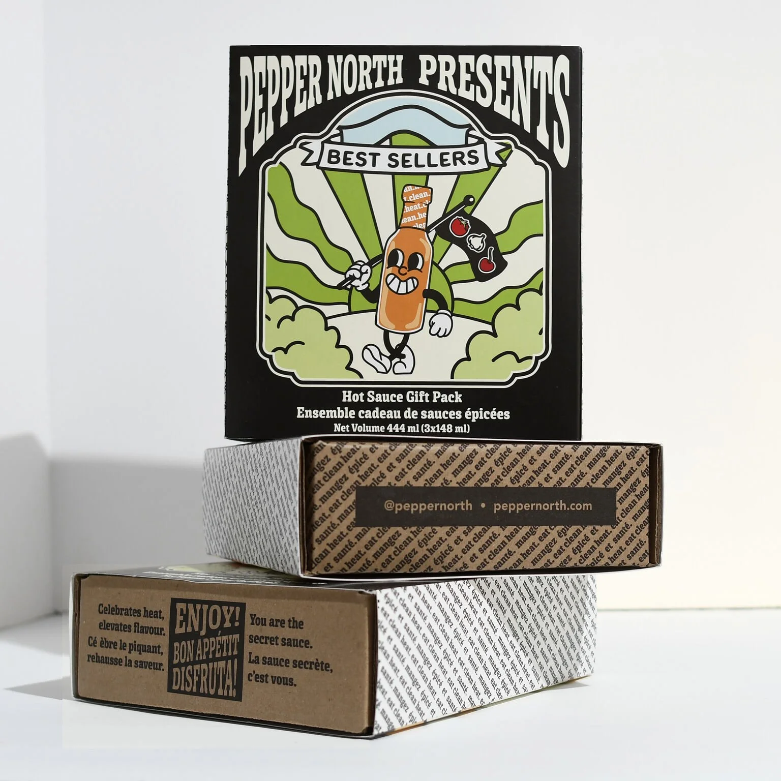
Engaged by Pepper North, a prominent Canadian hot sauce company, our mission was to enhance their e-commerce presence through the design of resilient gift boxes.
Our strategic approach involved the development of a distinguished collectible illustration series for each of the three gift sets.
Over the past few months I have been working with Pipeline Media Group to create a brand identity for its newest division, Pipeline Artists. Launched on March 19th 2021, Pipeline Artists serves as a creative hub for screenwriters, authors, and film-makers. A new logo mark incorporating their existing fox head imagery was created in close collaboration with their small team of executives.
I am also one fourth of Pipeline Artists’ team of designers and illustrators, providing the site with graphic editorial content. The included project features a set of five images that serve as title cards for categories of literature available on the site.
Emily Webster, a talented hairdresser by trade, is exploring new horizons in lifestyle branding, sparking a wealth of creative opportunities. Central to her brand's identity is a charming sun and moon design crafted in a nostalgic vintage mascot style.
Each shirt is meticulously designed to capture the essence of retro charm while appealing to modern tastes, offering wearers a stylish and playful expression of Emily's evolving brand narrative.
This custom coffee tumbler was designed for Ayla's Bagels & Coffee in Woodbury, CT. In collaboration with owner Michael O'Rourke, the concept highlights Woodbury's local businesses and landmarks. Created as a love letter to the community, the tumbler embodies a sleek and sophisticated design with a touch of local charm. These tumblers will also be distributed to the featured businesses for sale to their clientele.
This page is under construction.
Working alongside Eye-Candy Design, I designed and Illustrated this bold and beautiful label for Streamliners Espresso Bar’s new Cold Brew blend.
This exclusive t-shirt design was crafted for Common Ground Farm to showcase at farmers markets. Situated in Canada, Common Ground Farm is renowned as a certified organic farm dedicated to sustainable agriculture practices. With a commitment to leaving the land enriched, they cultivate a diverse array of vegetables across 18 acres of their 40-acre farm. Their methods include crop rotation, cover crops, and natural buffers, all aimed at enhancing soil health and safeguarding the environment. Embrace their ethos with this t-shirt, a testament to their passion for organic farming and environmental stewardship.
This piece, created in Rockport, MA during the summer of 2024, is inspired by the fruits of the season and the light pastel colors that represent summer. Measuring 10 x 10, it is painted with acrylic gouache on a wood panel.
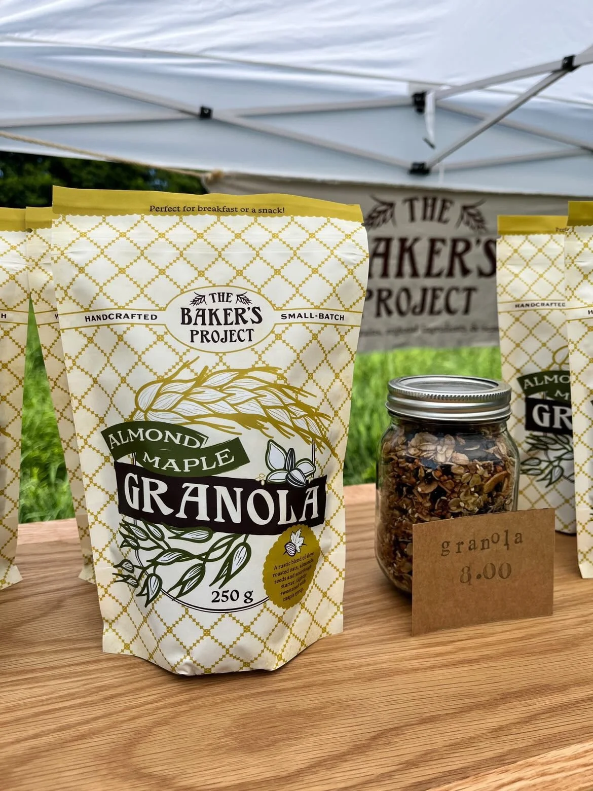
Teaming up with Amanda DeVries of Eye Candy Design, I played a key role in developing the branding and packaging for The Baker's Project, focusing on creating distinctive brand illustrations. Vanessa, the talented owner of London's newest bakery, is renowned for her exceptional baking skills and the use of high-quality, seasonal ingredients that reflect a genuine artisan touch, balanced perfectly to avoid overwhelming sweetness.
For The Baker's Project, we chose an illustrative style that captures the authenticity of Vanessa's craft, complemented by an approachable typeface and neutral color palette. This design approach not only highlights the bakery's commitment to quality and craftsmanship but also ensures its visual appeal resonates with customers seeking genuine, artisanal experiences.
Commissioned by Kismet Collinsville, a local gift shop, I had the privilege of creating a captivating mural for their storefront. Focused on the essence of the business, the design centered around calendula flowers, reflecting their significance in herbal practices embraced by one of the partners. The finished mural, adorned with vibrant yellow and orange hues, successfully enhanced the shop's visual appeal. Passersby were drawn in by its striking presence, and both business owners and customers praised the personalized touch it brought to the space. This collaboration was a successful showcase of my artistic skills while contributing to the unique identity of a local business.
Created in 2023, Paper Bag Girls represents a unique interpretation of self-portraiture. Serving as a poignant exploration, the series delves into the challenges of expressing and communicating emotions through conventional channels. There are moments when I sense a difficulty in embracing vulnerability, not fueled by fear of judgment but by a struggle to articulate feelings effectively. In navigating this internal landscape, I often find myself concealing both positive and negative emotions to prioritize the needs of others. These paintings serve as a visual contemplation on this nuanced aspect of self-expression.
This vibrant gouache painting, created in May 2024, finds its home within the pages of a watercolor media sketchbook. Each brushstroke celebrates the warmth and radiance of the summer sun, capturing its essence in a vivid golden tones.
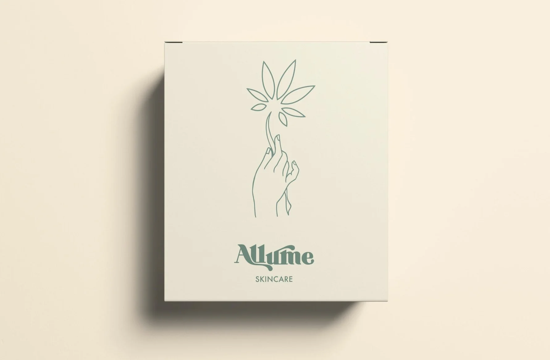
Allume is one of Canada's leading cannabis lifestyle shops, they offer a curated selection of goods for the discerning toker. You can find products from emerging and established makers in the cannabis space, from high-design pipes to rolling essentials.
The following project is a branding concept for a cannabis infused skincare line. It features an iconographic addition to their typographic logo to delineate it to its own line. Organic forms and line work help support the free-spirit of the existing brand.
Digital Illustration.
Whiskey Rocks is a country themed bar and restaurant located in Dudley, MA. In August of 2021, during its construction, the team approached me with an idea to create a mural to sit as a backdrop for their main stage. From the start their vision was clear and fun, I had a great time making this happen for them.
Riot Time Brewing’s limited edition run of canned cocktails, inspired by summers in New England.
The Garden Pantry is a completely plastic-free grocery experience. All food containers are brought by the customer or purchased on site, only glass or recycled bamboo options available.
The overall design keeps the brand approachable and earthy while still easily integrated into the urban setting of New Haven, CT.
Custom denim jacket painting commissioned in 2020.
Inspired by the lovely plant influencers of Tik Tok, I decided to create my dream indoor greenhouse, made possible with a well-known cabinet style from IKEA.
Mural concept done for my project 30 Days of Murals; available in full on my instagram (@emily.barnes.art).
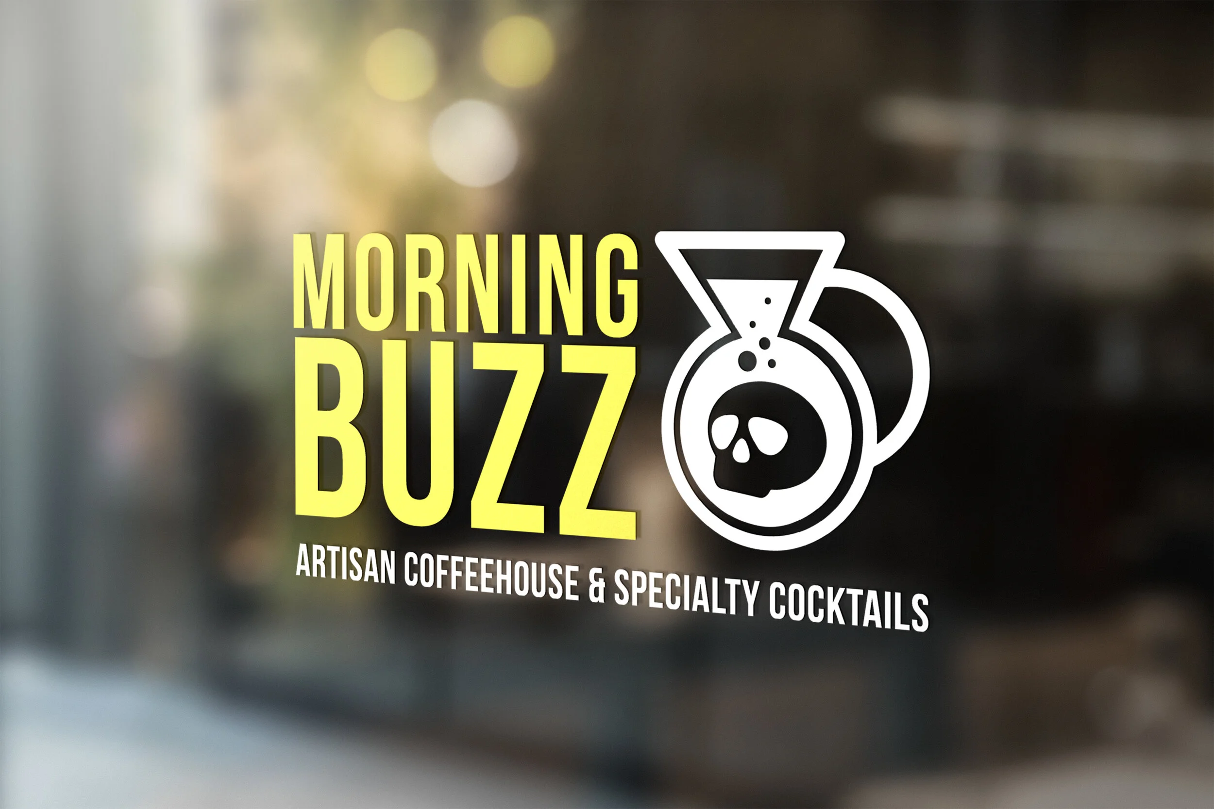
Morning Buzz is a concept coffeehouse located in Boston, MA that also doubles as a bar. The design and branding features high-contrast colors and a punchy feel, keeping its industrial roots and bringing it into the contemporary design world.
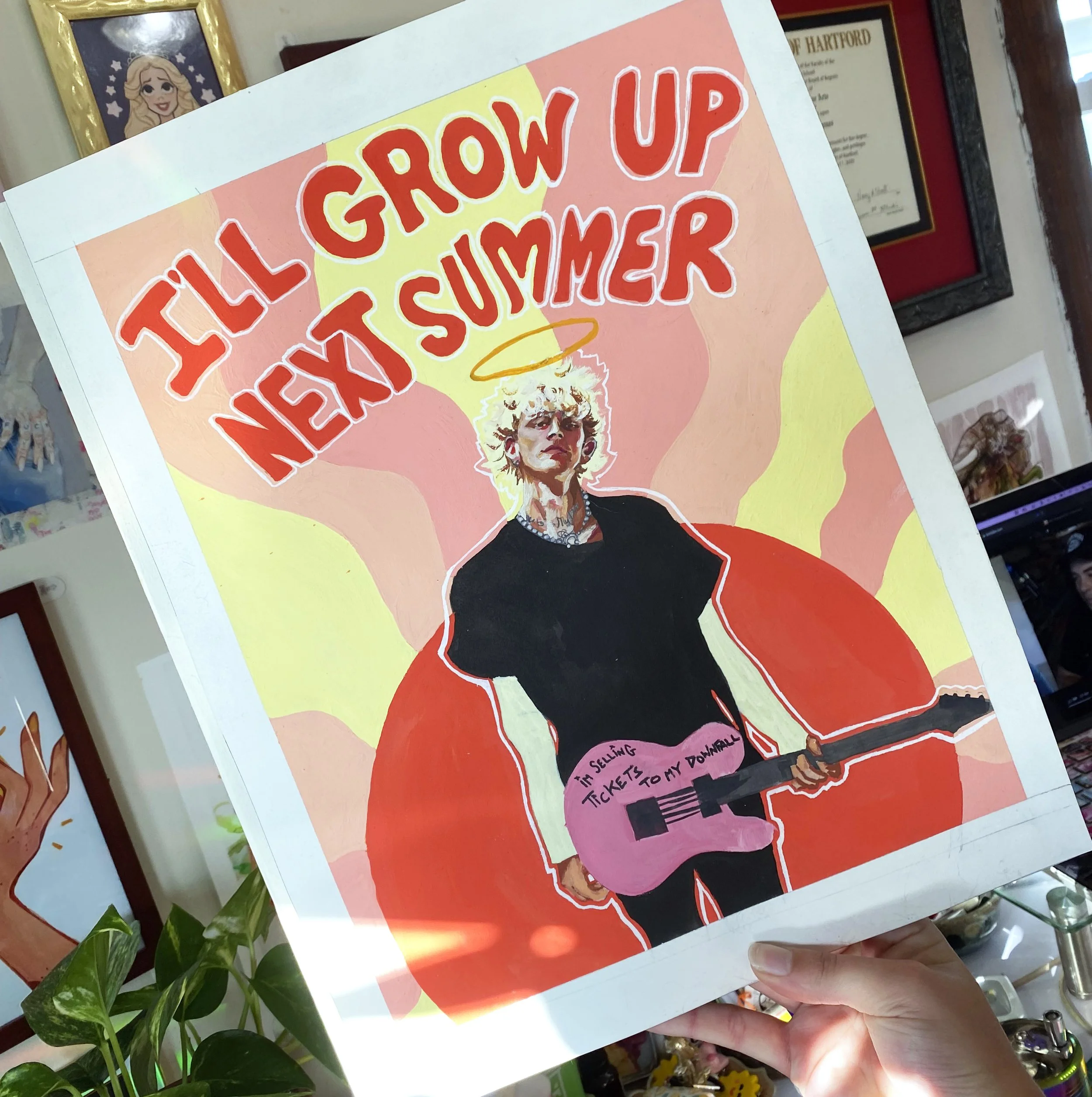
Gouache on paper. 11 x 14. 2021
Inspired by drunk face by Machine Gun Kelly
The following is a brand mascot concept created for SunBasket, a meal-plan and food delivery service. The prompt was to create a mascot for a kids offshoot brand.