
Nicaraguan Roots
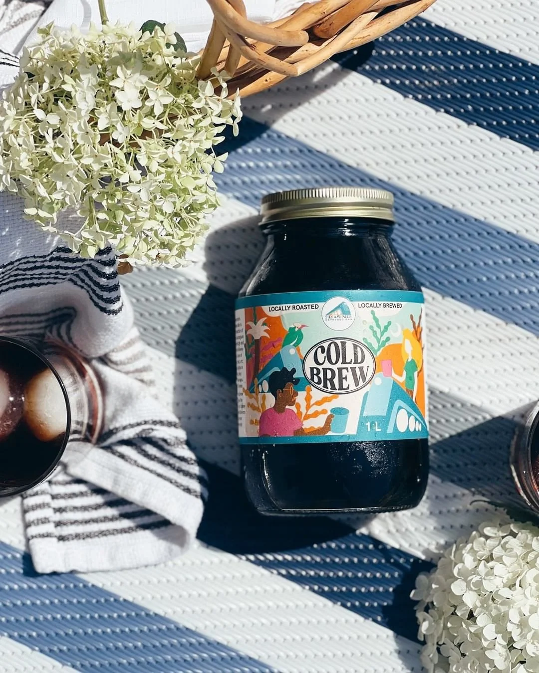
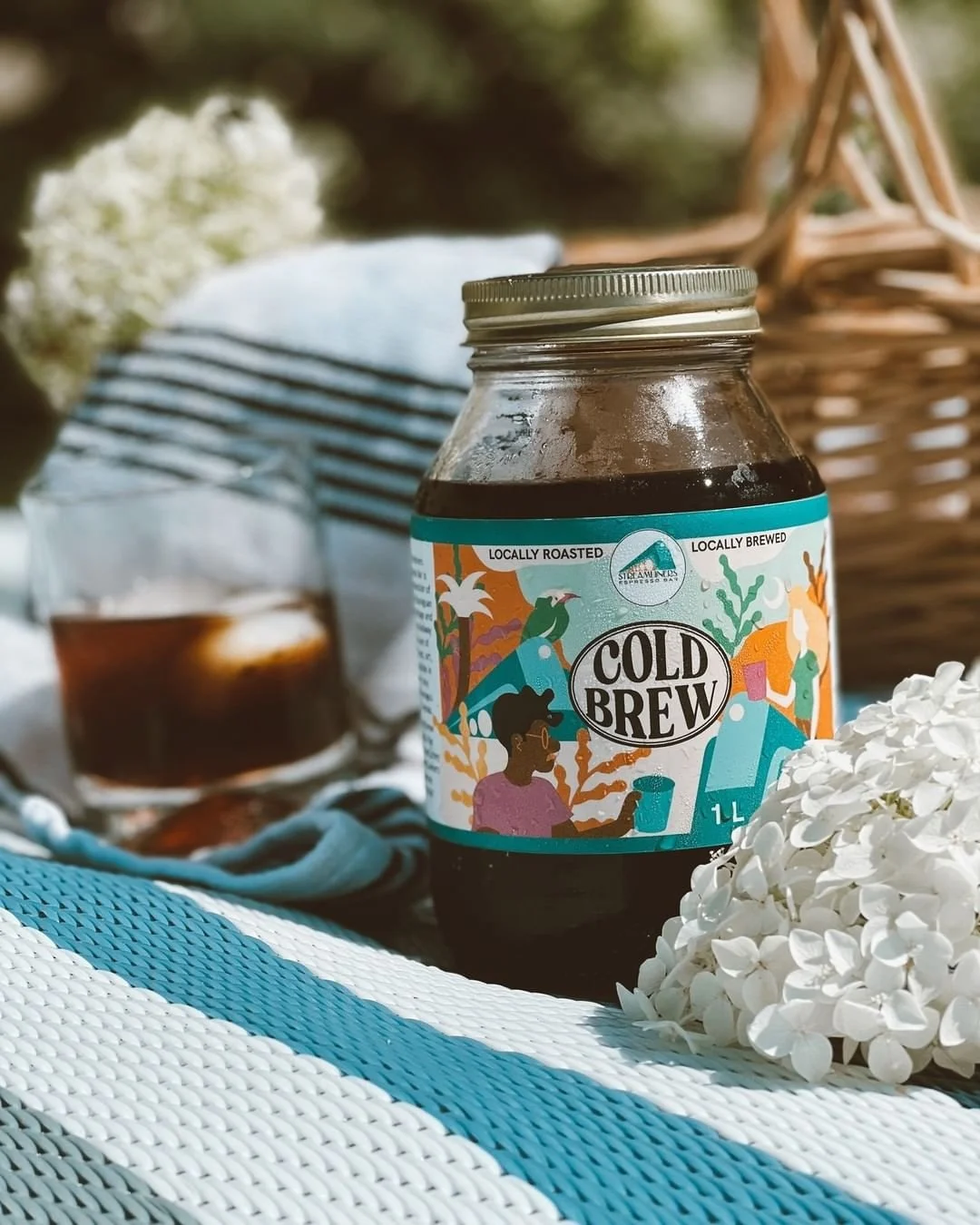
We wanted to make sure the label stayed true to the brand's roots while also feeling fresh and modern. Streamliners has a youthful vibe, so we knew we had to create something that would appeal to their target audience. But, we also wanted to pay homage to their Nicaraguan roots.
That's why we incorporated elements of Nicaragua into the design. We featured the country's national bird, which added a fun and unique touch to the illustration. The colors we chose were bold and eye-catching, which made the label really stand out on the shelf.
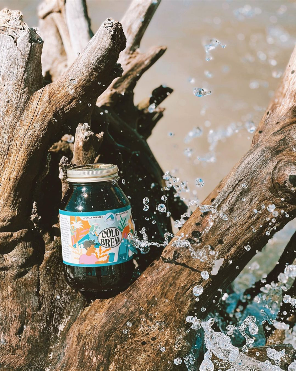
It was so much fun to work on this project, and I think the label turned out beautifully. I love how it captures the spirit of Streamliners while also incorporating elements of their cultural heritage. It's always a great feeling to see a project come together like this, especially when you know it's going to help a business succeed.
I'm excited to see the new Cold Brew blend out in the world, and I'm confident that the label we created will help it fly off the shelves.